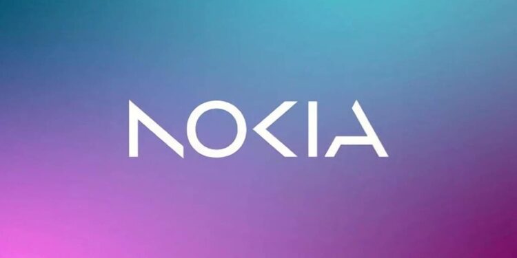
Nokia has unveiled a new logo in a bid to shift away from its iconic mobile manufacturer image for the first time in nearly 60 years, complete with a new logo, as the telecom equipment maker focuses on aggressive growth.
The new branding features five shapes forming the word NOKIA, in a range of colors depending on the use case.
Also Read: Famous Soft Drink Brand Coca-Cola collab with Realme to launch its Smartphone by 10 February
The company’s iconic blue has been replaced in order to symbolize its repositioning as a “business technology company,” rather than a mobile phone firm.
According to a press release, the new design aims to represent an “energized, dynamic, and modern Nokia,” reflecting the company’s core values and purpose.
“It has been designed as a symbol of collaboration, which Nokia believes to be critical for realizing the exponential potential of networks: unlocking gains in sustainability, productivity, and accessibility,” the statement read.
CEO Pekka Lundmark discussed the reasoning behind the rebranding in an interview with Bloomberg, stating: “In most people’s minds, we are still a successful mobile phone brand, but this is not what Nokia is about. We want to launch a new brand that is focusing very much on the networks and industrial digitalization, which is a completely different thing from the legacy mobile phones.”
The move away from Nokia’s previous identity as a phone manufacturer will be further demonstrated at this year’s Mobile World Congress in Barcelona.
Nokia’s new logo is emblematic of the company’s evolution towards the future and its efforts to distance itself from its past as a mobile phone company. It is a symbol of the new Nokia’s commitment to collaboration, technological innovation, and unlocking the potential of networks.


